Coordinating Cabinets, Flooring, and Countertops for a Cohesive Remodel
Matching your countertops with cabinets and floors requires coordinating three dominant visual elements through careful attention to color harmony, material relationships, and design principles that create cohesive, intentional spaces.
Creating a harmonious kitchen requires thoughtful coordination of countertops, cabinets, and flooring—the foundational elements that establish your space's visual character. When these components work together seamlessly, they enhance both beauty and functionality while reflecting your personal style.
Understanding color theory, undertones, and material relationships helps you achieve a balanced, professionally designed result—whether you're planning new cabinet installation or updating existing spaces. CabStone specializes in countertops and flooring solutions that bring your vision to life with expert guidance.
Key Takeaways
- Start with countertop selection for practical foundation: Choose your countertop first to establish a color palette, since natural stone like granite and marble contains unique patterns and variations that inspire coordinating cabinet and flooring choices.
- Apply the 60-30-10 rule for balanced distribution: Allocate sixty percent to dominant colors, thirty percent to secondary elements, and ten percent to accents like backsplash and hardware for spaces that feel balanced rather than chaotic.
- Match undertones rather than exact colors: Ensure warm undertones (yellow, red, brown) or cool undertones (blue, gray, green) stay consistent across flooring, cabinetry, and countertops to create unified aesthetics.
- Create intentional contrast for visual depth: Light cabinetry with dark countertops or vice versa provides sophisticated contrast, while matching all three elements in similar tones can make spaces feel flat and uninteresting.
- Test materials together under actual lighting: Visit showrooms with flooring samples when selecting countertops, and view materials together in your space under both natural and artificial lighting to confirm compatibility.
- Use islands as opportunities for focal points: Consider contrasting island cabinets or countertops with perimeter elements to create visual interest while maintaining cohesion through complementary colors.
Start with a Strategic Approach
Planning a renovation requires a methodical approach to coordinate flooring, cabinets, and countertops effectively. While many homeowners instinctively begin with cabinet selection, starting with your countertop provides the most practical foundation.
Why begin with countertops:
- Unique variations: Natural stone features patterns impossible to replicate
- Multiple accent colors: Stone contains several hues you can incorporate elsewhere
- Easier matching process: Matching cabinets to countertops proves simpler than the reverse
- Natural focal point: Countertops naturally draw the eye
It's easier to match cabinets and flooring to countertops than the reverse, especially with natural stone materials. These materials feature unique patterns, veining, and variations that can inspire your entire palette. Many homeowners find that a striking countertop becomes the inspiration for their design.
Once you select a countertop, you can establish your color trio—three colors chosen to complement or contrast with each other for visual appeal. Modern spaces often feature stark contrasts, while traditional designs favor neutrals with softer contrasts.
Understanding the 60-30-10 Design Rule
Interior designers rely on the 60-30-10 rule to create balanced, visually appealing spaces. This principle suggests allocating sixty percent to a dominant color, thirty percent to a secondary color, and ten percent to an accent. This proportionate distribution ensures harmony while allowing personality through well-chosen accent shades.
In practice, the sixty percent typically represents cabinets or walls, the thirty percent accounts for countertops or flooring, and the ten percent includes hardware, backsplash accents, or decorative elements. For example, a classic combination might feature sixty percent white cabinets, thirty percent gray countertops, and ten percent brushed gold hardware with a soft beige backsplash.
Benefits of this approach:
- Prevents visual chaos: Establishes clear color hierarchy
- Simplifies backsplash selection: Provides framework for complementary choices
- Allows bold accents: Ten percent adds personality without overwhelming
- Works across styles: Effective for modern, farmhouse, traditional, or transitional designs
This rule helps homeowners confidently choose colors while creating a polished, intentional look. Whether renovating or refreshing your space, this distribution principle ensures cohesive results.
Matching Kitchen Cabinets with Countertops
The relationship between cabinets and countertops defines your kitchen's overall aesthetic. Understanding how different cabinet colors pair with various countertop materials helps you create a cohesive look that matches your design vision.
| Cabinet Color | Best Countertop Choices | Design Effect | Style Match |
| White Cabinets | Black granite, light gray quartz, marble countertop | Classic contrast or soft elegance | Modern, traditional, transitional |
| Dark Cabinets | White quartz, cream granite, light gray | Brightness and balance | Contemporary, sophisticated |
| Wood Cabinets | Brown granite, beige quartz, warm stone | Natural harmony | Rustic, traditional, farmhouse |
| Gray Cabinets | Dark gray granite, white quartz, blue-toned stone | Monochromatic or subtle contrast | Modern, industrial, contemporary |
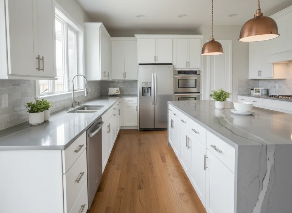
White or Light-Colored Cabinets
White cabinets provide timeless versatility, serving as a clean backdrop that allows countertop features to shine. For classic contrast, pair with black or dark gray granite, creating sophistication and visual drama. This high-contrast combination brings instant polish and works perfectly for modern, industrial, or traditional styles.
For softer aesthetics, consider white or light gray granite with subtle veining, adding depth without overwhelming the space. Warm beige or taupe quartz softens white cabinets, creating cozy, inviting atmospheres. Marble offers elegance with delicate veining, providing an upscale look suitable for both modern and classic designs.
For bold statements, blue or green granite transforms white spaces into showstoppers, adding personality ideal for eclectic designs. Let the countertop be the star and keep other elements neutral when using vibrant stone.
Dark Cabinets and Light Countertops
Dark cabinets—including espresso, charcoal, navy, or black—exude modern elegance and make bold statements. To balance their dramatic appearance, pair them with light-colored countertops. White, cream, or light gray granite provides beautiful contrast, preventing spaces from feeling too heavy or enclosed.
Light quartz creates striking effects against dark cabinetry, achieving balance and brightness. Choose creamy whites, soft grays, or beige to bring luminosity while highlighting warmth. For added visual interest, select granite with striking veining or patterns, such as white granite with black veins.
Pairing strategies for dark cabinetry:
- Maximum contrast: White quartz or marble with espresso cabinets
- Soft balance: Cream or beige granite with charcoal gray
- Dramatic monochrome: Black countertops with black cabinets (requires careful lighting)
- Warm sophistication: Taupe or tan granite with dark wood
Conversely, for bold drama, pair dark cabinets with black quartz or granite. This monochromatic approach creates sleek, cohesive designs perfect for contemporary spaces. Balance this heavy combination with lighter flooring and ample lighting to prevent darkness from overwhelming.
Natural Wood and Oak Cabinets
Warm wood cabinets—such as cherry, oak, or maple from a skilled cabinet maker—bring natural, cozy feelings to spaces.When pairing with granite countertops, choose stone with warm undertones to complement the wood's richness. Brown, gold, or beige granite works particularly well, creating harmonious, inviting atmospheres.
For added drama, consider granite with red or orange veining to enhance wood's warmth. To avoid overwhelming spaces with too much warmth, choose flooring in different tones—cooler if cabinets are warm, or warmer if they're pale or gray-washed. Matte finishes and subtle texture keep looks cohesive.
Gray Cabinets
Gray cabinets—popular among custom cabinet makers for their versatility—offer trendy choices working with various countertop colors. For monochromatic, contemporary looks, pair gray cabinets with dark gray or black granite, creating sleek, cohesive designs. For contrast, consider white or light gray granite—subtle shade differences add interest and depth.
For unique touches, choose granite with blue or green undertones, complementing gray's cool tones. Neutral elegance emerges with gray quartz countertops paired with dark cabinetry, providing timeless options.
Coordinating Kitchen Floor with Cabinets and Countertops
Your kitchen floor should ground your design without competing for attention. Flooring choice significantly impacts how your space feels and functions, serving as the literal foundation that ties elements of your kitchen together.
General Principles for Kitchen Flooring Coordination
There are two common approaches to coordinate kitchen flooring with cabinets and countertops. First, coordinate the floor color with cabinets and countertops so flooring acts as a secondary color, meaning hardwood or tile floors closely match cabinet colors or dominant countertop shades.
Second, choose contrasting accent colors for your kitchen floor—if cabinets and countertops provide close matches, contrasting colors make floors bold visual statements. Perfect color matches aren't necessary; similar shades that complement each other provide attractive appearances for any kitchen space.
Flooring coordination strategies:
- Harmonious matching: Floor tone echoes cabinet or countertop colors
- Intentional contrast: Dark floors with light cabinets create dimension
- Temperature consistency: Match warm or cool undertones across all surfaces
- Scale consideration: Larger flooring patterns for smaller kitchens, detailed patterns for spacious areas
Whether your kitchen floor should be lighter or darker than cabinets depends on your desired style and cabinet colors. Darker flooring gives kitchens dramatic, moody flair, especially when paired with lighter cabinets. The high contrast creates dimension and sophisticated appeal in your kitchen design.
Light Granite with Dark Kitchen Floors
Light granite or quartz pairs beautifully with darker flooring—dark hardwood or dark tile floors ground spaces while making countertops appear brighter. This mix creates balance, making kitchens feel complete and cohesive. The contrast between light countertops and dark flooring adds depth without overwhelming the visual field.
Small kitchen spaces particularly benefit from this combination, as light countertops reflect natural light while dark floors provide grounding without making the room feel cramped. This approach works exceptionally well in modern kitchens seeking sophisticated, high-contrast aesthetics.
Dark Countertops with Light Floors
Dark granite or black countertops pair beautifully with light floors—oak, maple, or pale tile work well. Floors soften granite's heavy tones, creating open, bright pairings while keeping the countertop as the main focal point. This combination prevents kitchens from feeling too dark or closed in.
The lighter flooring choice brightens rooms and creates contrast that enhances the dramatic appeal of dark countertops. This approach proves particularly effective in kitchens with limited natural light, where light floors help maximize brightness and create illusions of more space.
Understanding Undertones and Color Temperature
Matching undertones proves more critical than matching exact colors when coordinating elements. Even if two surfaces seem to match, their undertones might clash, creating subtle discord that disrupts cohesion.
Warm undertones (yellow, red, or brown) work best with wood finishes and warm stones like travertine. Cool undertones (blue, gray, or green) pair well with quartz, marble, or light gray painted cabinets. When selecting colors, consider white's specific shade—cooler whites pair with countertops in gray or white with gray veining, highlighting sleek qualities.
Undertone matching guidelines:
- Warm palette: Honey oak cabinets, beige granite, warm-toned hardwood
- Cool palette: Gray cabinets, white quartz, gray tile
- Mixed approach: Neutral bridge elements connect warm and cool tones
- Consistency priority: All three elements should share undertone temperature
For warmer whites, countertops with warmer beige flecks bring natural warmth and freshness. Warm or cool undertones should stay consistent across flooring, cabinetry, and countertops to maintain harmony.
Attempting to "warm up" white and gray spaces with mismatched beige walls represents a classic mistake. If you're installing wood floors, spaces will have plenty of warmth—white and wood create balanced combinations where white is crisp and airy while wood is warm and grounded.
The Role of Lighting in Color Selection
Natural light plays significant roles in shaping color palettes and enhancing visual appeal. Sunlight highlights certain hues, creates depth, and affects overall moods. When selecting colors, be mindful of their appearance in natural light—some hues appear differently under sunlight than under artificial light.
Colors can appear drastically different under varying lighting conditions; what looks great in stores might translate poorly at home. Test chosen colors under natural and artificial lighting to avoid this mistake. Consider how colors change throughout the day—from morning sunlight to evening incandescence.
Lighting considerations:
- North-facing rooms: Cool light favors warm cabinet and countertop colors
- South-facing rooms: Warm light suits cool or neutral palettes
- Artificial warm lighting (2700-3000K): Enhances rich wooden cabinetry and warm schemes
- Artificial cool lighting (3500-4100K): Complements contemporary designs with grays and blues
Natural light paired with thoughtful design creates warmth that fixtures alone can't match. It helps countertops shine and surfaces flicker gently throughout the day. Lighter materials—pale oak, creamy whites, soft grays—bounce light across spaces.
Take time with selections by sampling finishes and materials under various lighting conditions. Place different materials next to each other in your space to see how they interact under natural and artificial lighting before final decisions.
Backsplash Coordination
Backsplashes no longer exist just to protect walls—they create unique focal points. You should always consider countertops and cabinets when selecting a backsplash, knowing there are many ways to match looks through complementing, mixing, and contrasting colors and patterns.
The rule of thumb involves either complementing or contrasting with surrounding elements. Consider choosing backsplashes that harmonize with dominant colors and patterns of countertops and cabinetry for cohesive looks. Alternatively, introducing contrast through color or texture creates visual interest.
Pairing strategies:
- Continuation approach: Extend countertop material up the wall for seamless flow
- Complementary colors: Choose tile that picks up accent colors from granite or marble
- Neutral bridge: White or gray subway tile works with virtually any combination
- Bold contrast: Colorful backsplash becomes focal point against neutral surfaces
Using dark cabinets with light-colored countertops already offers contrast. You can complete this appearance with white tile continuing the flow, creating bright, spacious atmospheres. With dark wood cabinets, using simple white backsplashes balances textural wood appearances.
Your backsplash will look better blending with cabinets and walls on vertical planes where it interacts more than with narrow strips of countertop. This vertical relationship creates natural visual flow.
Creating Contrast and Balance
Intentional contrast adds depth and sophistication. Light cabinetry pairs beautifully with medium or dark flooring, while lighter floors open up smaller spaces. Aim for at least one element of contrast to create visual depth.
Light cabinets plus dark countertops create bold, sophisticated contrast. Dark cabinets plus light countertops make spaces feel more open and airy. Mid-tone cabinets plus natural stone offer seamless, organic feels.
Contrast strategies:
- Value contrast: Combine light and dark shades for dimension
- Temperature contrast: Mix warm wood with cool stone surfaces
- Texture contrast: Pair smooth countertops with textured tile
- Pattern contrast: Balance busy granite with simple, solid cabinet colors
Balance between light and dark elements adds depth and interest. If you choose dark flooring, opt for lighter countertops to prevent spaces from feeling too heavy. A good rule involves placing darker colors below work surfaces and keeping things bright and airy above.
Islands as Design Focal Points
Your island provides opportunities to create contrasting focal points or maintain cohesion. You may choose to match your island exactly with identical cabinets and countertops. Another popular choice involves creating contrast—choosing different shades within your color scheme for island cabinets and countertops.
For balance, consider using matching cabinets with contrasting countertops for a focal point that still provides cohesion. Contrasting countertops create elegance and sophistication, making rooms more eye-catching.
Common Mistakes to Avoid
Several common errors can disrupt cohesion. Matching backsplashes to countertops represents a frequent mistake—your backsplash looks better blending with cabinets and walls on vertical planes where it interacts more than with narrow countertop strips.
Trying to match hard finishes and paint colors to wood floors represents another classic error. Wood tones are rarely major considerations when choosing colors—instead, focus on undertones and overall temperature.
Mistakes that disrupt harmony:
- Too many competing patterns: Busy granite, patterned tile, and decorative backsplash create chaos
- Ignoring undertone consistency: Mixing warm and cool undertones without intention
- Overlooking adjacent spaces: Colors should flow into connected dining or living areas
- Skipping physical samples: Relying solely on digital representations
- Matching everything exactly: Creates flat, uninteresting spaces without dimension
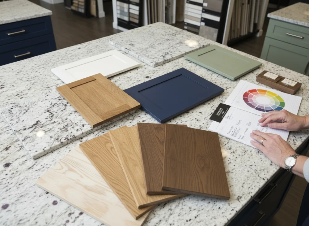
Incorporating mishmashes of unrelated colors results in visual chaos. To avoid this, establish cohesive schemes by selecting three colors and a couple of complementary shades from the color wheel.
Testing and Sampling Materials
Selecting colors based solely on small swatches or digital representations can lead to unexpected outcomes. To avoid disappointment, test samples of chosen colors and materials directly in your space. View countertop material samples against cabinet samples and observe how they interact.
Take samples home and view them under different lighting conditions to confirm compatibility. Design teams frequently recommend bringing floor samples when selecting countertops, allowing you to layer materials together in real time.
Effective sampling strategies:
- Large samples: Request countertop and cabinet samples at least 12x12 inches
- Multiple lighting tests: View materials in morning, afternoon, and evening light
- Adjacent placement: Place all three elements side-by-side to assess coordination
- Extended evaluation: Live with samples for several days before final decisions
Seeing flooring against countertop surfaces ensures both materials work together in color and scale. Place different materials next to each other to see how they interact under natural and artificial lighting before making final selections.
Conclusion
Creating cohesive spaces that harmonize countertops, cabinets, and flooring requires thoughtful planning—from professional cabinet installation to careful attention to color theory, undertones, and material relationships. By starting with your countertop selection, applying the 60-30-10 rule, and ensuring consistent undertones across all elements, you can achieve professionally designed results. Testing materials together and under actual lighting conditions prevents costly mistakes.
The relationship between cabinets, countertops, and flooring defines your space's overall character and functionality. Whether you choose bold contrasts for dramatic impact or harmonious tones for serene elegance, intentional coordination creates spaces that reflect your personal style. Expert guidance throughout the selection process helps navigate the overwhelming array of choices available.
Contact CabStone to explore our countertops and flooring options, and discover how our showroom experts and custom cabinet maker team can help you create the cohesive, beautiful space you've been planning.
Frequently Asked Questions
Should I match my countertops to my cabinets or flooring first?
Start by selecting your kitchen countertop first, especially with natural stone like granite or marble that contains unique color variations. This provides a practical foundation since it's easier to match kitchen cabinets and flooring to countertops than the reverse, and stone patterns can inspire your entire color palette.
What is the 60-30-10 rule for kitchen design?
The 60-30-10 rule allocates sixty percent to dominant cabinet colors, thirty percent to countertops and kitchen flooring, and ten percent to accent color elements like tile backsplash and hardware. This creates balanced, cohesive kitchen designs that prevent visual chaos while allowing personality through accents.
Can I use dark cabinets with dark countertops?
Yes, pairing dark cabinets with black countertops creates sleek, monochromatic designs perfect for contemporary kitchens. However, balance this heavy color combination with lighter flooring and ample lighting to prevent your kitchen space from feeling too dark or enclosed.
How do I choose flooring that coordinates with white cabinets?
White or light-colored cabinets work with virtually any kitchen floor choice. For contrast, choose dark hardwood or dark tile floors. For harmonious looks, select light oak, pale tile, or medium-toned wood that maintains brightness while adding warmth to your kitchen space.
Should my backsplash match my countertops or cabinets?
Your tile backsplash should complement kitchen cabinets and walls on vertical planes rather than matching countertops. Choose backsplash that harmonizes with dominant cabinet colors or introduces complementary colors from your granite or marble countertop patterns for a cohesive look.
What are warm vs. cool undertones in kitchen materials?
Warm undertones include yellow, red, or brown hues found in oak cabinets and beige granite. Cool undertones include blue, gray, or green found in painted cabinets and white quartz. Matching undertones across your kitchen floor, cabinetry, and countertops creates harmonious coordination.
How important is lighting when choosing kitchen colors?
Lighting dramatically affects color appearance. Test cabinet finishes and countertop materials under both natural and artificial lighting in your kitchen space. North-facing kitchens favor warm colors, while south-facing spaces suit cool or neutral color palettes for optimal visual appeal.
Can I create contrast with my kitchen island?
Yes, kitchen islands provide excellent opportunities for focal point contrast. Choose different cabinet colors or contrasting countertops for your island while maintaining color harmony with the rest of your kitchen through complementary colors from your established palette.
What's the best flooring choice for small kitchens?
Light-colored kitchen flooring makes small kitchen spaces feel larger by reflecting light and creating illusions of more space. Consider light oak, pale tile, or light gray hardwood paired with white cabinets and light countertops to maximize brightness and openness.
How do I avoid common mistakes when coordinating kitchen elements?
Test materials together in your showroom, ensure consistent warm or cool undertones across all surfaces, limit to three colors plus one accent color, place at least one element of contrast for depth, and consider how your kitchen colors flow into adjacent living spaces for continuity.